OFFICE
CREATIVE
Bright Colors of the Arts / Connected nonprofit partner
BIG COLOR.
BIG IDEAS.
Brand expression, learning materials and print.
A playful visual world for art and learning. A look at BCOTA’s brand materials, an approved lesson refresh and a printed school activity.
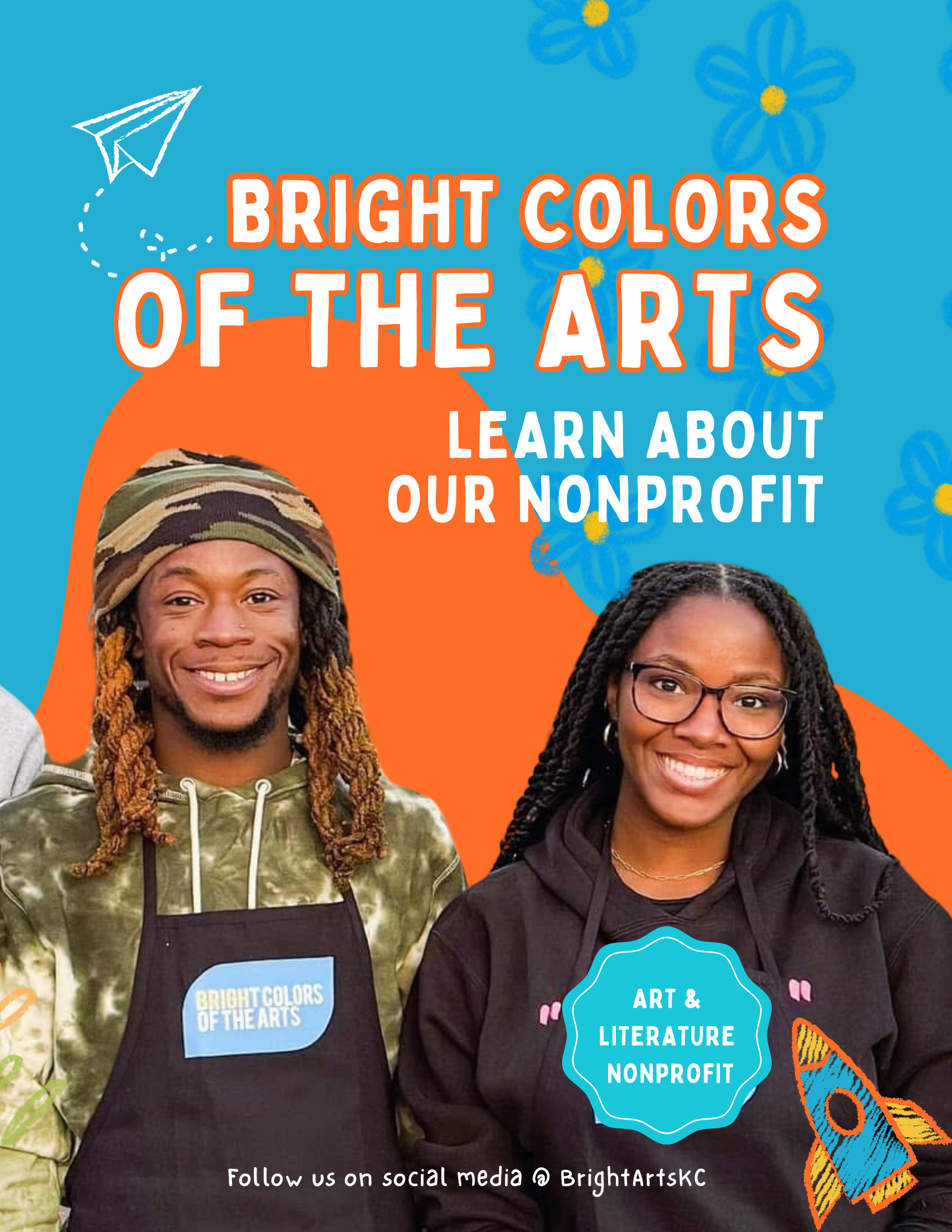
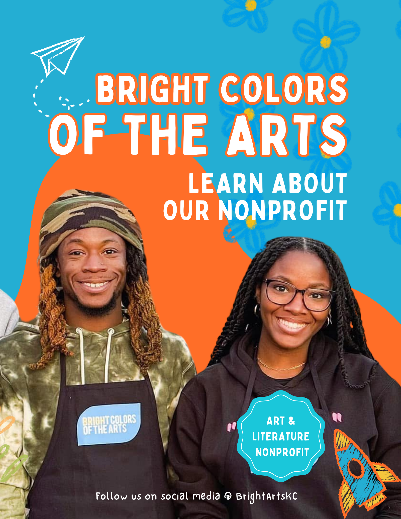
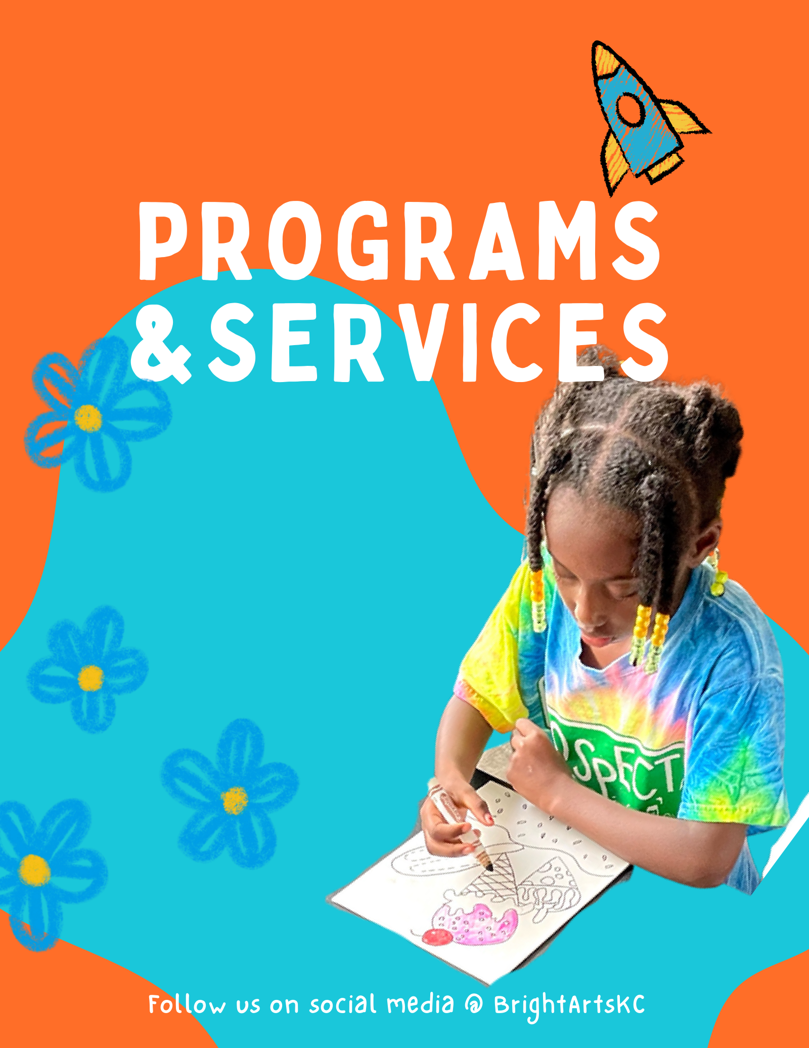
Cover of the nonprofit brochure.
What we do
Connect visual presentation, educational design and print support. This showcase brings together existing BCOTA collateral, an approved lesson refresh and Bright Office’s printing contribution to a school coloring activity.
Existing brand materials
A recognizable
creative character.
The saved brochure provides context for BCOTA’s orange and turquoise palette, expressive typography, illustration motifs and use of real photography.
Approved design refresh
Learning materials
with personality.
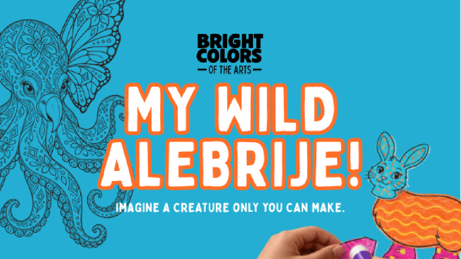
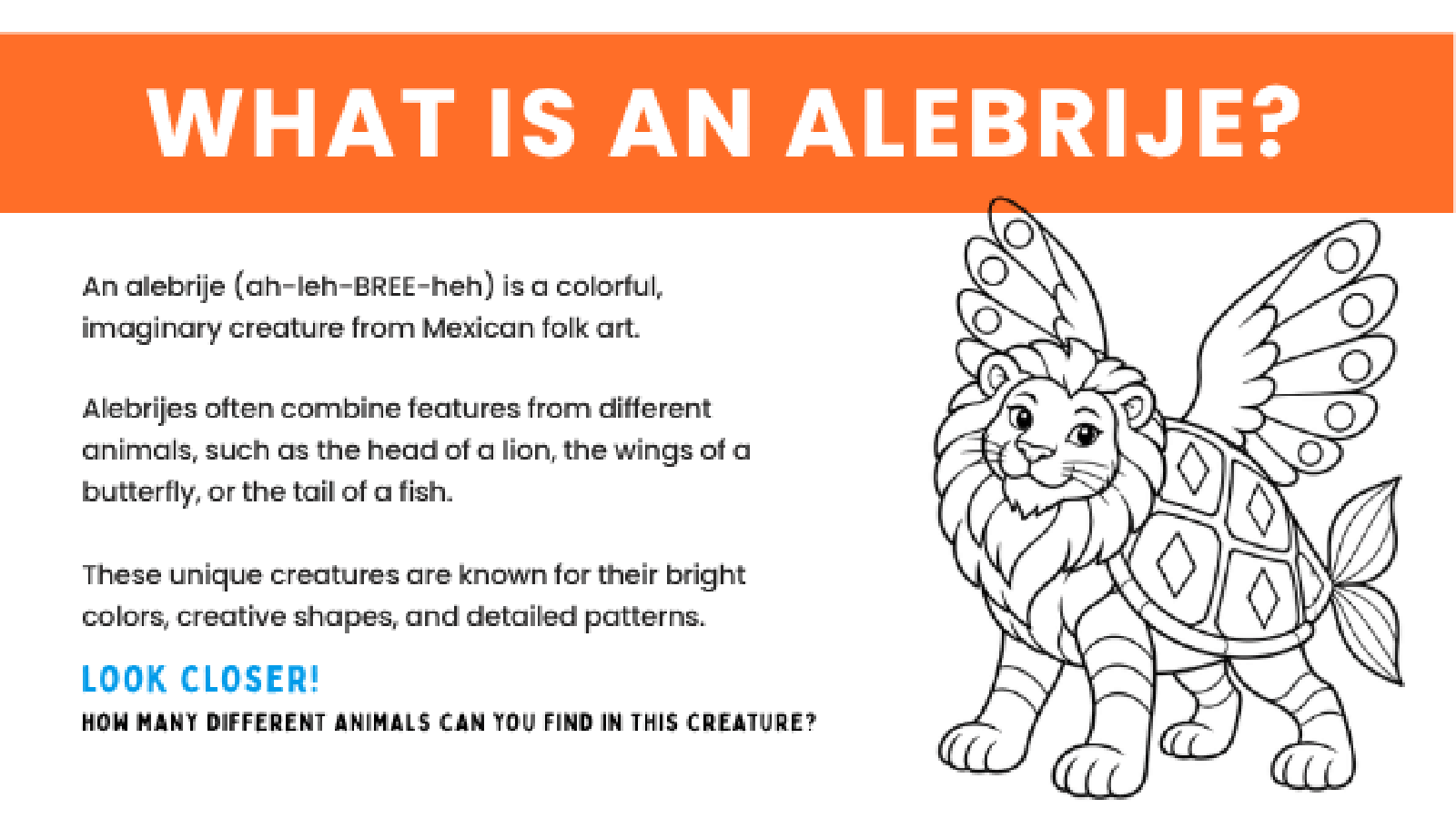
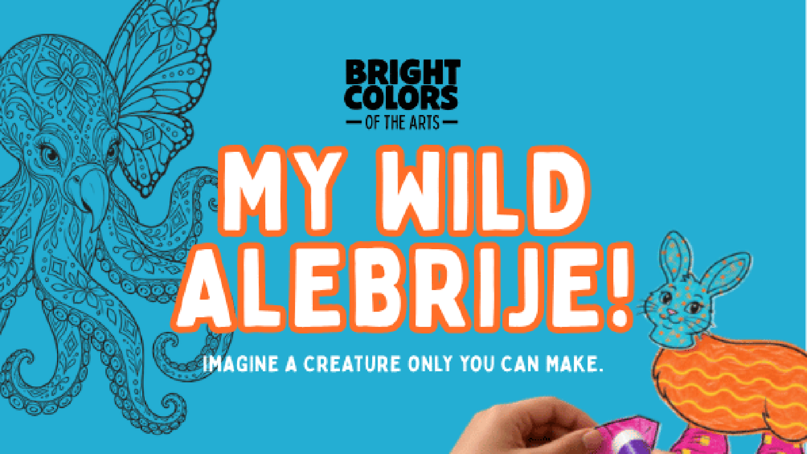
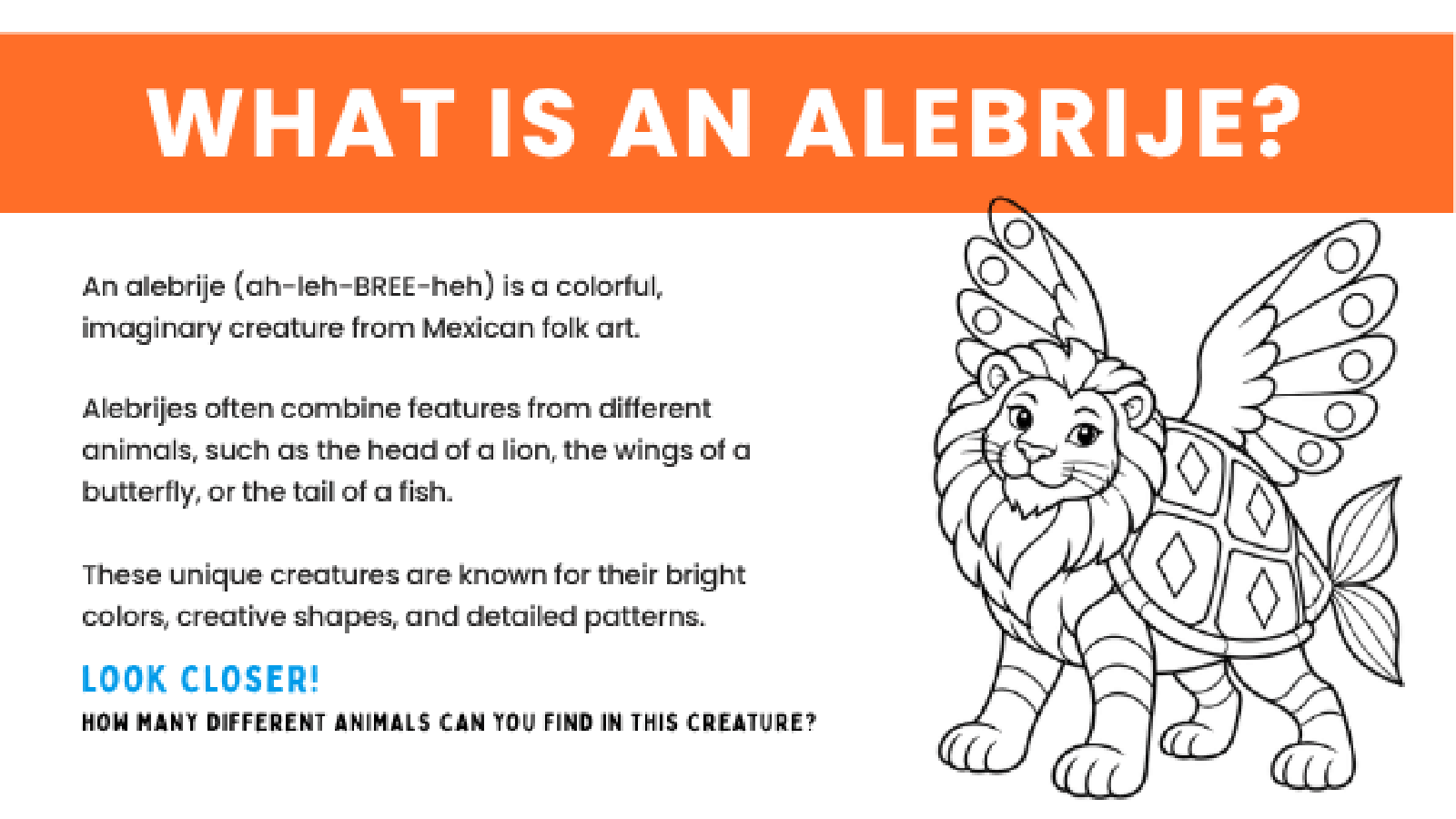
The first two My Wild Alebrije slides were refreshed as part of an approved lesson presentation, bringing the brand’s energy into educational design.
Completed printing support
From a page
to participation.
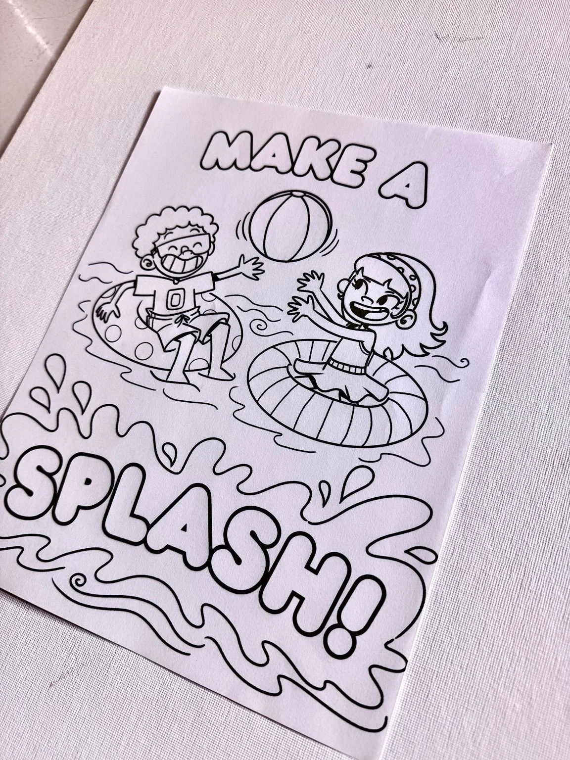
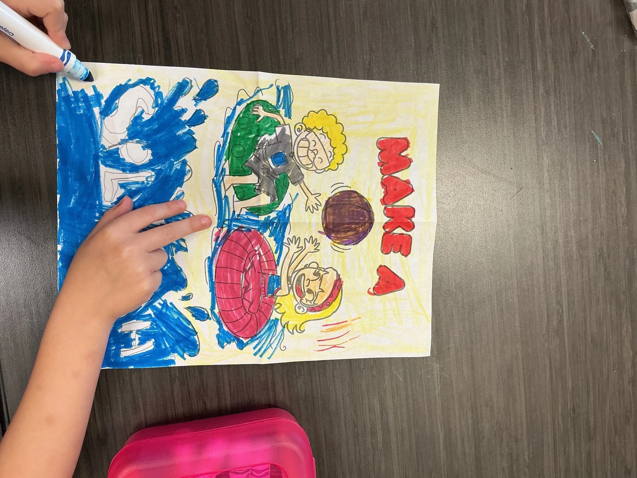
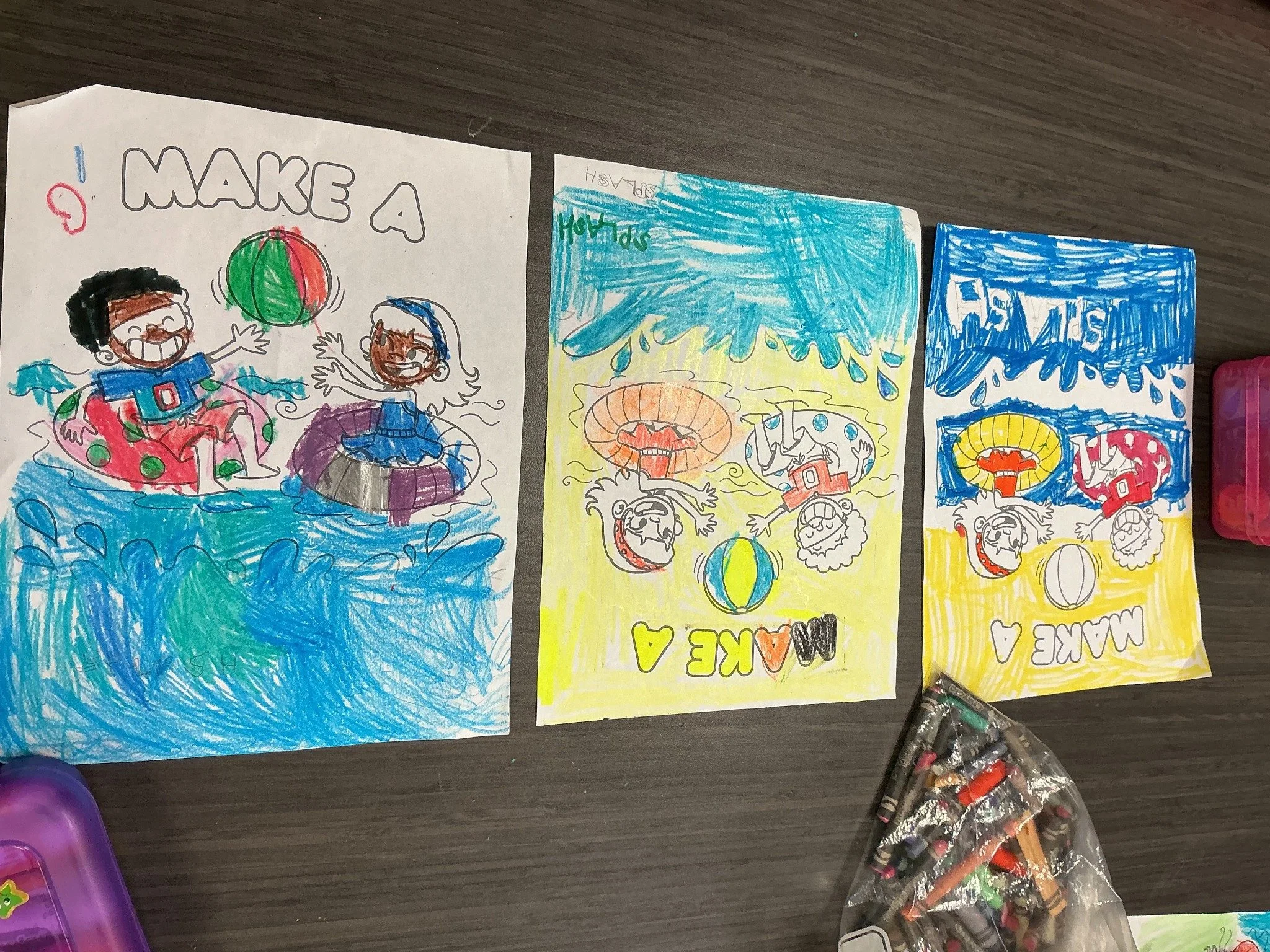
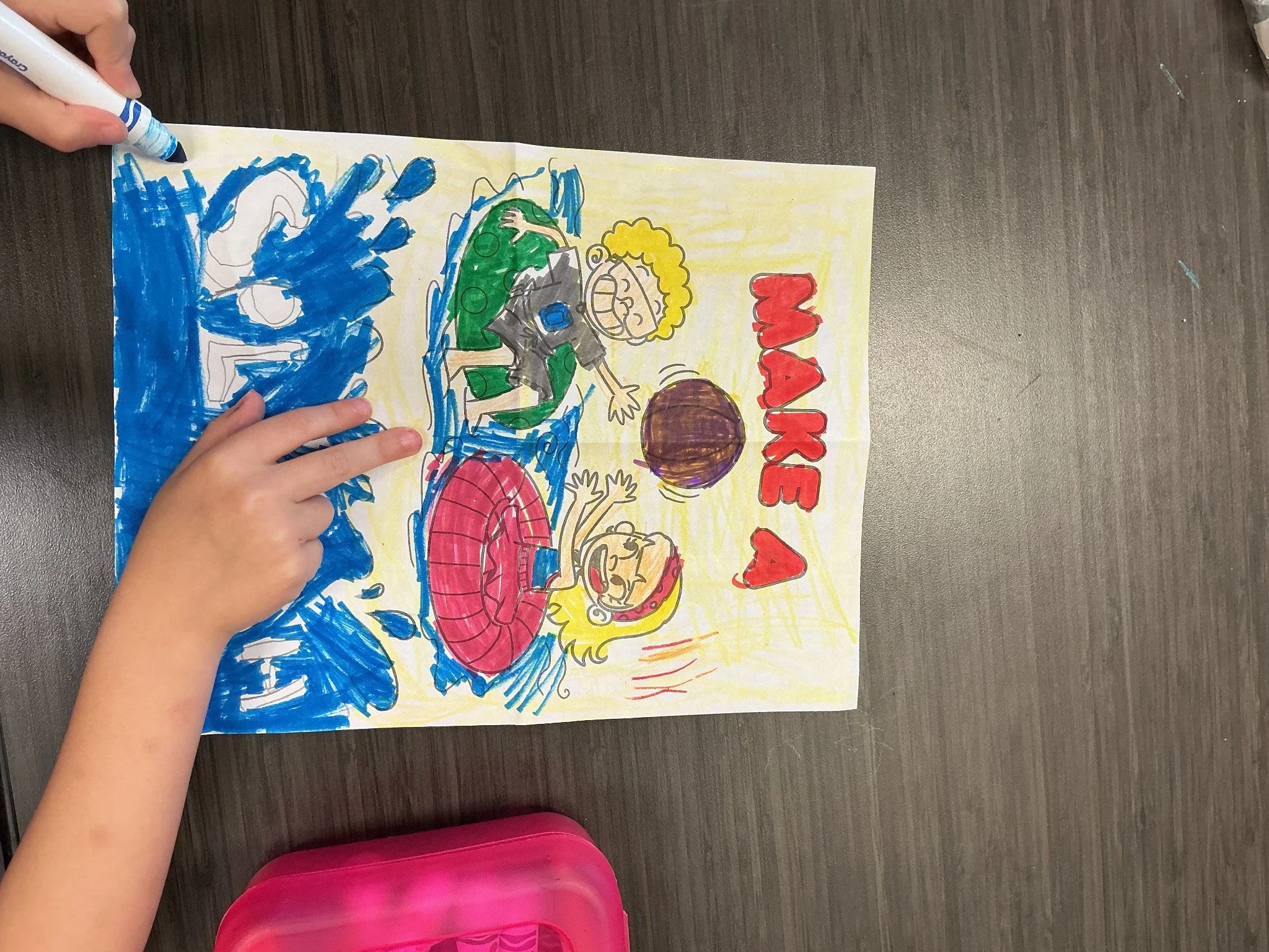
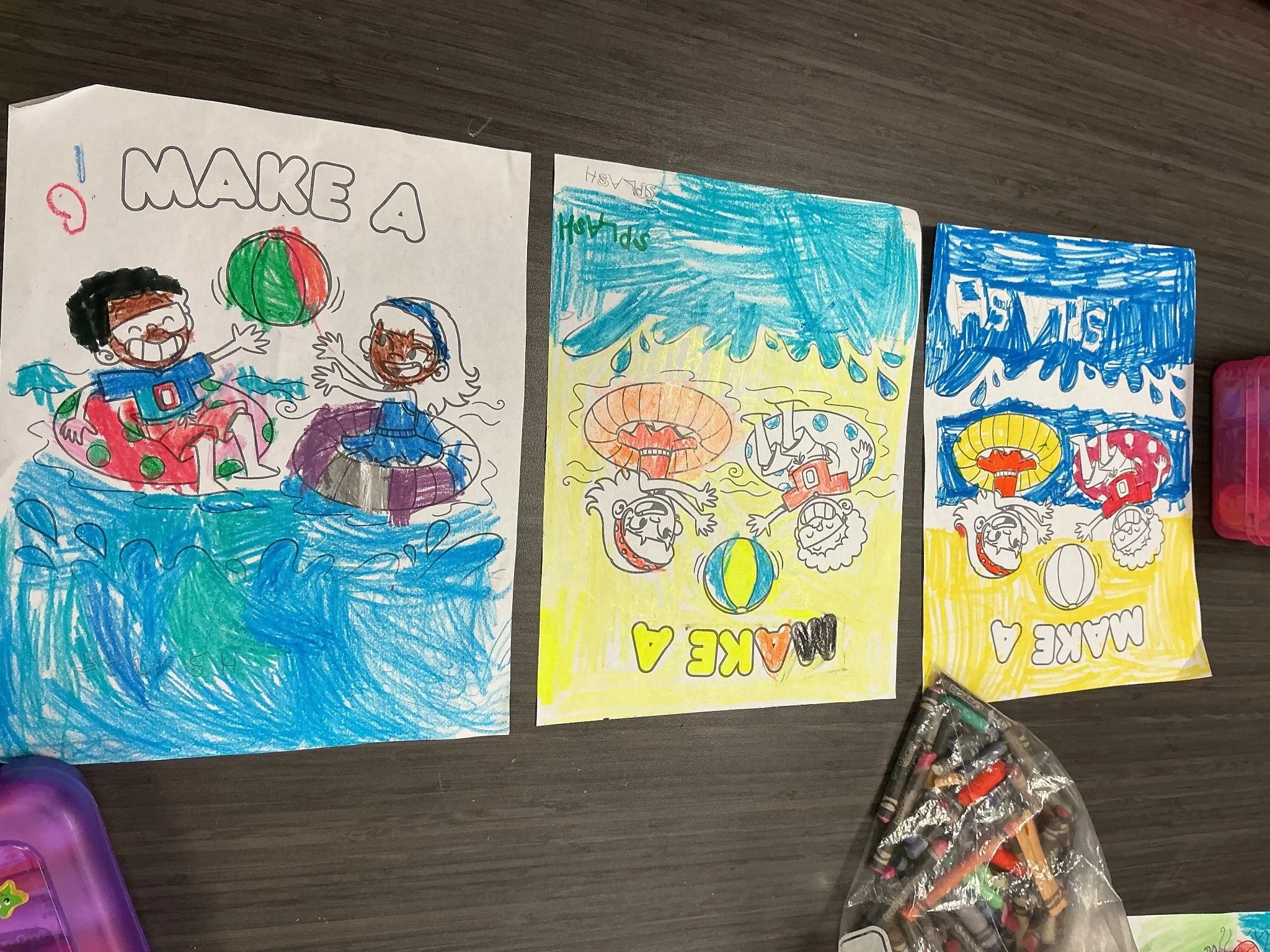
Bright Office helped print the Swim KC and BCOTA school coloring activity. The activity combined coloring with bubble letters and typography.
01 / Brand expression
PLAYFUL.
ON PURPOSE.
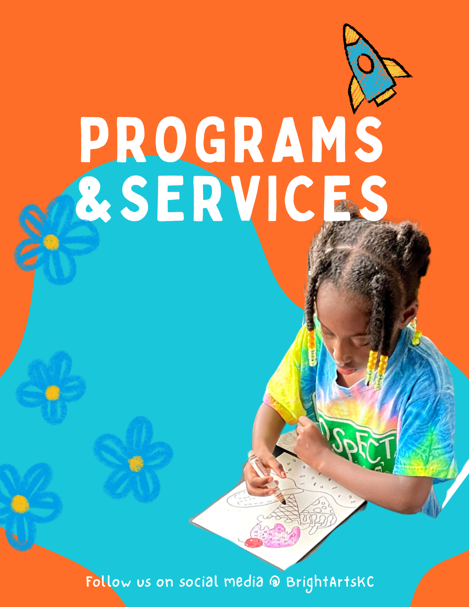
Orange and turquoise, oversized headings and hand-drawn motifs give the existing collateral a recognizable creative character. Flowers, a paper plane and a rocket appear alongside real people making art.
Colors from the original brochure.
02 / Educational design
IMAGINATION,
ON THE PAGE.
The My Wild Alebrije refresh carries the same energy into a lesson presentation: bold titles, a clear introduction and playful visual prompts.
Make room
to look closer.
An illustrated creature sits beside a short explanation and a prompt for observation. The layout gives the idea and the activity distinct places on the page.
Lesson presentation design / First two pages.
03 / Completed print contribution
A PAGE.
A MARKER.
A LITTLE
IMAGINATION.
A completed school coloring activity connected Swim KC with Bright Colors of the Arts. Students explored bubble letters and typography through a water-themed page.
Bright Office supported the printing. The first coloring sheet was created by Kansas City artist Aliya Ali.
BCOTA is the separate nonprofit arts partner. Swim KC provides the water safety connection.
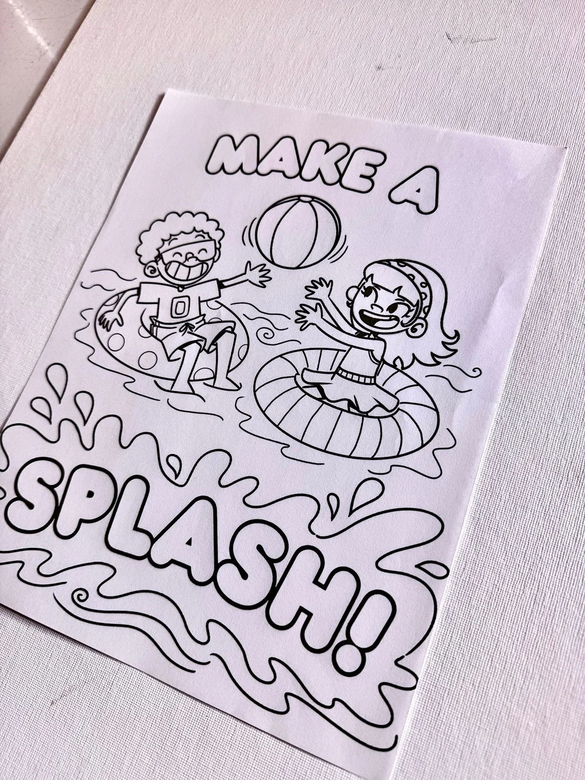
Actual Make a Splash activity page.
Connected.
Not the same organization.
Bright Colors of the Arts is a separate nonprofit partner. Its programs are distinct from Bright Office Creative’s paid creative services. Existing brand collateral is shown as context alongside the specific design and printing work identified above.
Your next idea